Postingan

Menampilkan postingan dari Januari, 2013

So you want to hire a decorator
Gambar
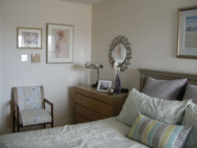
Many people think that working with a decorator is out of their reach financially  or that the results of the pairing would create a space that wasn't personal.  Neither of the se belie fs are true if  homeowners  matche their  needs with the ri ght decorator's skill set .    Professional decorators usually hold a set of  basic b eliefs about designing spaces that support  their intera ctions with clients .   For example I believe :  everyone deserves a beautiful space ....    Margaret Ryall   interesting and inviting interiors can exist without a high price tag;     Photography: Brian Ricks   a space should reflect the needs and interests of the owner;    Margaret Ryall   furniture arrangement makes or breaks a space; Margaret Ryall personal items are the best accessories; Margaret Ryall editing a space can transform it;       Margaret Ryall   laye...
How do you like your blue?

Gambar
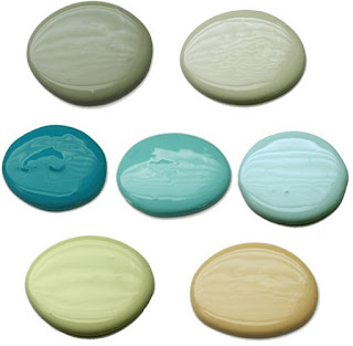
source I spend part of every year living on the edge of the Atlantic Ocean in a small community in Newfoundland.  Being in such close proximity to the sea influences my colour interests.  It is no surprise that I like watery blue greens. These combinations show up in both of my homes and even in my art work.      Margaret Ryall , Slow Drift (2012)  6x8 in.  encaustic monotype on board  Lisa Sherry When you mix spring greens and  watery blues the result is always  fresh and lively. There are lots of patterns and textures in this room and the use of an old map as wall art references  land and sea.  Are you beginning to see how both of my careers dovetail?  Interior design and visual art feed each other on a daily basis in my life. Lots of times looking at a room will give me an idea of an art series! source This is lovely combination  inspired by the spectacular art work over the sofa.  The room is fresh and in...

Is coral an 80's colour?

Gambar
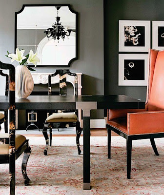
 Colour is the least expensive change you can make to your space and still have huge impact.   Certain colours often get a bad reputation because they were overly popular at a certain period.  No colours get more ridicule than the salmons, corals  and peaches because they were everywhere is the mid 80's.  But don't let that stop you from using them. It's all in the pairings.  These designs are timely and inviting.   What do you think? Salmony orange  with charcoal gray can be extremely elegant and contemporary.  Many Turkish rugs use salmon as one of the main colours which makes this a timeless colour.    You can put any colour with black and white and it looks stunning.    And with white and soft gray this version of orange  is positively fresh.  If  you like something a little more restful consider muted oranges with  earth tones ...   like in this lovely living room... or mix in blue with...

2013 decor trends with staying power

Gambar
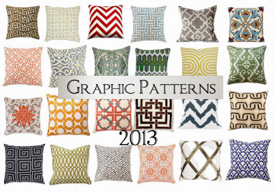
Here are predictions for 2013 that should  have some staying power..... Geometric patterning Really, geometric patterning has never  gone out of style; it has periods of resurgence and 2012-13 seems to be one of those periods. source source Pantone's colour of t he year 2013 (Emerald) in a  geometric trellis pattern  with a botanical motif on cushions.  I've always loved the look of florals and other nature inspired themes  with geometrics.What is fresher than white and green? Nature motifs  Naural elements run the gamut from  flora or fauna to stones and seashells.  Use of feather motifs and faux furs are on the upswing .   Look for botanical or animal motifs in art,  fabrics, or accessories.  Eye for Design  Peacock feathers are everywhere lately.  I just saw a great display on the Pier 1 website and here's another selection.  The colours are so fresh; you can't go wrong with a peacock blue accent in your home...