Postingan

Menampilkan postingan dari Februari, 2014

My furniture painting secrets

Gambar
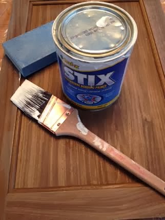
Do you learn the hard way and wish at the end you had checked things out a little more thoroughly?  This  overconfidence gets me in hot water more times than I would like to admit, but learn I do!  I paint furniture frequently.  That means lots of experience from too many mistakes. Here's my recipe now. What goes under a paint job is very important especially if you are painting a hard surface like laminate. My best painting tip in these situations is .... My top pick for a bonding primer   use STIX bonding primer  as a base on just about anything, and then go with the paint of your choice on top of it - my fav is below.  With used furniture degrease with TSP or vinegar and do a light sanding with a sanding pad or electric sander. Paint doesn't like grease, and I always feel better if I sand a bit first. No need to overdo it! The Facts on STIX  Keep in mind: STIX is not a paint but a  primer/sealant, only a thin translucent coat is required; you are not gaining anything by goi

Blue- A home decor trend to watch

Gambar
 It seems like only yesterday I  wrote my  2013  home decor trends  post,  and I've already looked at Pantone's Colour of the year , Radiant Orchid, and suggested  ways to integrate this vibrant colour into your decor. What else can we expect in the coming year? While Radiant Orchid is P antone's colour of the year, I think it will be the blues that will take over the stage in 2014.  Joan Mitchell had this all figured out in her 1972 painting!  She painted the best blues ever and these are the ones you'll be seeing more of in 2014. Joan Mitchell, “Blue Territory,” 1972  And here's a modern interpretation of the darker side of blue... A range of blues for 2014 This year the popular blues are much deeper leaning toward cobalt and navy.  But what can you put with so much blue?  Add yellow as an accent in 2014 Gold accents work well  with navy blue and cobalt And don't forget vibrant oranges or greens with dark blues.  The sky is the limit with this colour.  I thou

5 Creative uses for fabric in home decor

Gambar
One of the major mistakes homeowners make in home decor is ignoring the power of pattern in creating an interesting space. Fabric is an excellent way to introduce pattern into your space and there are so many ways to use it.   I am a sucker for fabric patterns and textures and often buy  on spec when I find a good deal. If you are removing fabric from a room e.g., drapes, you may be able to upcycle them.  Don't forget about the beautiful fabric finds at thrift stores.  Be creative.  These ideas should get you thinking.  Make a throw Look for large scale textured fabrics and sew on a fringe to create a throw for your sofa.   source    Heavy fabrics work best for this application.  If you think it is heavy enough to upholster a dining chair it will be heavy enough to pull off this look .  If you don't like fringes omit that element and just do a double top stitched seam.  FYI this image is a bought throw.    Upholstery fabric folded over a chair back - as simple as it gets Marga

Thursday Tip # 12- Art above the sofa

Gambar
Do you have  one big blank space above the sofa?  Are you wondering how to fill it?  If the number of questions I get about this is any indication there are lots of question marks out there about this topic.  Ta da... answers.  I  introduced this topic a little in last week's Thursday Tip  when I discussed scale, but I wanted to give more formatting options this week.   This is an area where there are lots of thoughts on how to and how not to hang art for best effect. My guideline is to think about ways to fill at least 2/3 the width of the furniture. It is often difficult to find large scale art so think about pairings of various types.  It also looks good if your art expands to the edges of the sofa.  Once you go beyond  sofa width the art starts to look very top heavy and the sofa  is diminished. You should also consider the height of the art.   Remember it is a long way to the ceiling so refrain from work that is only twelve or 14 inches high.  It will look lost even if it is l

Thursday Tip # 11 - Art and space

Gambar
After a long hiatus I am back to Thursday Tips at the request of a reader who liked these short and to the point tips for "small improvements that have big impact".  For this week my favourite topic - art. The biggest mistake made when hanging art is not matching the size/shape of the art work to the space you are hanging it.   Work should look "comfortable" in its space not cramped or looking like it is awash in a sea of wall. Layout follows vertical space source Long console needs substantial work to fill space source Perfect  size and composition for top of stairs source Size and shape  works with width of headboard source Art shape and size  follows wall shape source And there you have it.  Large works for large spaces or smaller works massed together for impact.  No little pieces lonely on a big wall.  No large pieces squat into a small space.  Oh, did I mention I have a lot of opinions on gallery walls?  I'll save that for another tip.