Postingan

Menampilkan postingan dengan label art arrangement

Thursday Tip # 12- Art above the sofa
Gambar
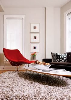
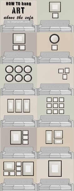
Do you have  one big blank space above the sofa?  Are you wondering how to fill it?  If the number of questions I get about this is any indication there are lots of question marks out there about this topic.  Ta da... answers.  I  introduced this topic a little in last week's Thursday Tip  when I discussed scale, but I wanted to give more formatting options this week.   This is an area where there are lots of thoughts on how to and how not to hang art for best effect. My guideline is to think about ways to fill at least 2/3 the width of the furniture. It is often difficult to find large scale art so think about pairings of various types.  It also looks good if your art expands to the edges of the sofa.  Once you go beyond  sofa width the art starts to look very top heavy and the sofa  is diminished. You should also consider the height of the art.   Remember it is a long way to the ceiling so refrain from work that is only twelve or 14 inches high.  It will look lost even if it is l

Thursday Tip # 11 - Art and space

Gambar
After a long hiatus I am back to Thursday Tips at the request of a reader who liked these short and to the point tips for "small improvements that have big impact".  For this week my favourite topic - art. The biggest mistake made when hanging art is not matching the size/shape of the art work to the space you are hanging it.   Work should look "comfortable" in its space not cramped or looking like it is awash in a sea of wall. Layout follows vertical space source Long console needs substantial work to fill space source Perfect  size and composition for top of stairs source Size and shape  works with width of headboard source Art shape and size  follows wall shape source And there you have it.  Large works for large spaces or smaller works massed together for impact.  No little pieces lonely on a big wall.  No large pieces squat into a small space.  Oh, did I mention I have a lot of opinions on gallery walls?  I'll save that for another tip.

Leaning art: 4 Guidelines to make it work

Gambar
Art warms a home, makes it interesting, provides topics for conversation and contemplation , adds colour,  the list goes on indefinitely.  There are various ways to display art; some are more successful than others.  One option is leaning  art against a wall rather than hanging it, but this display option isn't always successful for a variety of reasons.  If you want to try leaning art, consider the following factors. 1. Scale - Choose artwork large enough to read from standing or sitting  position Mark Dodge Design    The size of a piece of art in comparison to the space and objects around it usually determines successful placement. This painting fits the bill perfectly.     Large scale images work best source When you want to lean work on the floor it needs to be large enough to observe from standing position and bold in imagery so it can be read at a distance. Even the dog get this!  The photo on the right works better than the  the art to the left of it because the image is

Design Solutions: A bed between two windows

Gambar
Work is keeping me quite busy over the last several weeks and blogging always drops off when this happens.  I'm beginning a series of posts called Design Solutions that will  address common design issues that often crop up when I work with clients.This is a great way for me to come to  terms with options and at the same time it provides a written commentary that I can send clients to in the future.  If I can help my readers in any way, it's a bonus. Being a lover of asymmetrical balance, I can't explain why I am so attracted to the placement of a bed between two windows.  But I am. The windows become part of a larger design tableau in such instances, and the whole wall must be considered as a unit including headboard, night tables, lamps, table vignettes, art, window treatments and bedding.   Here are several guiding principles to keep in mind.  Keep it symmetrical   When you start with a layout that is symmetrical, it works best to continue using this form of balance in yo