Thursday Tip # 12- Art above the sofa
Do you have one big blank space above the sofa? Are you wondering how to fill it? If the number of questions I get about this is any indication there are lots of question marks out there about this topic. Ta da... answers. I introduced this topic a little in last week's Thursday Tip when I discussed scale, but I wanted to give more formatting options this week.
This is an area where there are lots of thoughts on how to and how not to hang art for best effect.
My guideline is to think about ways to fill at least 2/3 the width of the furniture. It is often difficult to find large scale art so think about pairings of various types. It also looks good if your art expands to the edges of the sofa. Once you go beyond sofa width the art starts to look very top heavy and the sofa is diminished. You should also consider the height of the art. Remember it is a long way to the ceiling so refrain from work that is only twelve or 14 inches high. It will look lost even if it is long enough.
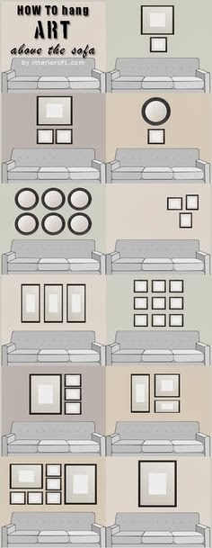
I have to thank Interiors PL for creating this great graphic that provides many options for what to hang over a sofa.
My favourites in these options are 4, and 6-11. They all fit the guidelines I discussed above. 1 and 3 are my least favourite because they don't fill up enough space for me. I like 5 because it is asymmetrical and I could balance this placement by adding things on the left of the sofa to create a pleasing balance. Richard Mishaan discussed another aspect of asymmetrical placement in a House Beautiful post.
Here is the same idea expressed in one of my painting compositions called Breathe.
Are any of these options wrong? Not really. There are only guidelines in interior design, no right or wrong.
Do you have a favourite way to arrange art above your sofa? Please share.
This is an area where there are lots of thoughts on how to and how not to hang art for best effect.
My guideline is to think about ways to fill at least 2/3 the width of the furniture. It is often difficult to find large scale art so think about pairings of various types. It also looks good if your art expands to the edges of the sofa. Once you go beyond sofa width the art starts to look very top heavy and the sofa is diminished. You should also consider the height of the art. Remember it is a long way to the ceiling so refrain from work that is only twelve or 14 inches high. It will look lost even if it is long enough.
I have to thank Interiors PL for creating this great graphic that provides many options for what to hang over a sofa.
 | ||
| 11 options for hanging art over a sofa. |
 |
| Why asymmetrical layouts work |
Here is the same idea expressed in one of my painting compositions called Breathe.
Margaret Ryall, 2004, Breathe, acrylic on canvas, 12 x 24in.
Are any of these options wrong? Not really. There are only guidelines in interior design, no right or wrong.
Do you have a favourite way to arrange art above your sofa? Please share.

Komentar
Posting Komentar