The art of a welcoming entry
Choosing the right piece of art for you entry can set a welcoming scene for your home.
When I have the option, I always choose art first and then build a room around it rather than buy art to match a space. It's the artist in me, you need a focal point in a room that doesn't have an architectural one, and art is your most versatile choice.
I designed this small space several years ago, but it is still on trend today. Here are some elements to think about before making an art purchase for any space, but in particular small spaces where you many only have one piece of art.
Scale
This contained front entry is a narrow space with a high ceiling. The bench is low and dark and was to the right of the door. The table also dark was to the left of the door.
Always choose work that mimics the shape of the space you are filling.
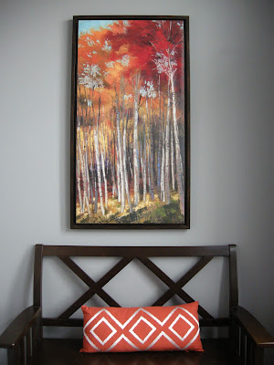
In a smaller space I often use one piece of art rather than an array of smaller pieces, but that's personal preference. The vertical orientation of this painting helps bridge the space between the low bench back and the high ceiling. The vertical lines of the trees also helps move the eye up.
The width of the painting is roughly 2/3 of the bench width. This is always a good proportion.
Finding just the right piece of art is always a challenge, but in my mind the right piece can make a whole space sing.
When I have the option, I always choose art first and then build a room around it rather than buy art to match a space. It's the artist in me, you need a focal point in a room that doesn't have an architectural one, and art is your most versatile choice.
I designed this small space several years ago, but it is still on trend today. Here are some elements to think about before making an art purchase for any space, but in particular small spaces where you many only have one piece of art.
Scale
This contained front entry is a narrow space with a high ceiling. The bench is low and dark and was to the right of the door. The table also dark was to the left of the door.
Always choose work that mimics the shape of the space you are filling.
In a smaller space I often use one piece of art rather than an array of smaller pieces, but that's personal preference. The vertical orientation of this painting helps bridge the space between the low bench back and the high ceiling. The vertical lines of the trees also helps move the eye up.
The width of the painting is roughly 2/3 of the bench width. This is always a good proportion.
Colour
The walls are a cool blue grey and were part of the original colour scheme of the house. Cool colours in an entry with little light can lead to a depressing space. One of the best ways to move a visually cool space to an inviting one is to choose work that has very warm colours. There's also nothing like nature's colours to warm a space.
The walls are a cool blue grey and were part of the original colour scheme of the house. Cool colours in an entry with little light can lead to a depressing space. One of the best ways to move a visually cool space to an inviting one is to choose work that has very warm colours. There's also nothing like nature's colours to warm a space.
Repetition
Once I chose the art for the focal point in this space, I moved the colour around in the pillow and flowers on the opposite wall. Also note the repetition of the diamonds from the bench back to the orange pillow and the cut crystal vase. The vertical lines in the tree trunks are also reinforced in the tall, sparse floral arrangement and the lamp. Even the verticals in the door frame are doing their part in repetition.
Contrast
This is where your space will sink or swim. Every room needs contrast or will be boring. Contrast creates layers/depth and helps mover your eye around a space. The dark woods in this space stand out against the light walls. The white flower, dish, lamp shade and trim work stand out against the walls and the darker wood.
Subject matter
Choose images you connect with and forget about what everyone else thinks. If a work doesn't speak to you why bother to have it?


Komentar
Posting Komentar